Tuesday, 17 January 2012

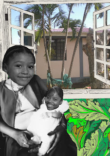
'The Essence of belonging' Other versions & ideas

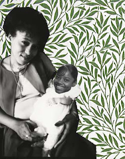
The use of Opacity and masks

Visually image opacity had to be changed


As I was finishing the updating of my Digital journey I thought it was only right  that I tried to include as much of the practising, different composites and the way I played with photoshops tools.........so here goes! Some of them are very similar but they show my thought process and the way I decided to change my composition.


Selection tools


One of my first practises with selection tools before I mastered masks


I


I know that I have a long way to go and  there is plenty more to learn using Photoshop. I still have to play with Filters and all the other  amazing tools that Photoshop has to offer performing illustration and photographic tricks etc but I feel that I have achieved so much in such a short space of time.
I am very excited for the future and I will be spending the next 3 weeks practicing with all my new Digital friends, Photoshop, InDesign, Illustrator and Flash.


'InDesign Brochures'

InDesign was another programme that was used on my Digital journey, although I wasn't familiar with it  I had used Quark Express in the past, but not in a professional or even competent manner.
It was not too difficult overall producing the colour brochure.  Text and picture frames were used to place photos from photoshop and text from within the  InDesign programme. I think the beauty of InDesign was its accuracy which made the construction of the brochure far easier to produce than if this had to be done accurately by eye.


Here we had to produce the same brochure but had to prepare it to be printed in only 1 colour.
I knew from past experiences in printing that all I had to really do was produce the brochure in black and white then the colour print would be straight forward. The font colour was changed to black and white and the photos were altered in photoshop using Adjustments/black and white. The same  could have also been achieved with channels or by playing with the Hue and Saturation.


A sample of my first try at using InDesign.


Animation time! Moving Autumn leaves! The Essence of Belonging!

https://docs.google.com/open?id=0ByhgB1kQO-G-M2UzYjhjMjktMTM1OC00MTY3LWExYzEtNGM3NTAxYTNmYzAx


Wow! It just shows what a little bit  perseverance can achieve, the animation was created using Flash. The background image was a jpeg image imported from photoshop, while the moving leaf was saved as a PNG file imported into the flash library, onto the stage and converted to a symbol.
It was exciting and very addictive playing around with The Flash animation programme but I also realised that you do have to make the time to master it.
I suppose that is the one thing the I can say I have got out of my first ever Digital journey, the more time you spend practicing and trying out the programmes the packages the wiser and creative you become.

I have just spend an hour trying to master putting my animation files onto blogger and perseverance paid off.
Want to see some more of my animations remember i have never done anything like this before?

https://docs.google.com/open?id=0ByhgB1kQO-G-ODcyMmE1NTMtMzI0My00N2ZlLWIxYjgtMGJiNDU1ZDA0NTU0

The Essence of belonging composite was used to create an animation using Photoshop CS5. The images were all put into an animation folder and a document was opened in photoshop that was the same dimensions as the image files. Images are loaded as individual layers and are made into frames. Each layers image was moved (altered slightly) and each frame was set the same duration.  The file was saved as a GIF file, size 200 x 200 pixels in either direction.https://docs.google.com/open?id=0ByhgB1kQO-G-N2FiOTc2ZGMtYWYzNy00YjgyLWJkZWQtMzJlODcwYjg5ZTRl

The second file was saved as a GIF file with the sam e dimensions as above and was put on a loop so that the animation continues playing.

Sunday, 1 January 2012

'The Essence of Belonging' Update

Michael’s feedback of my first A3 print out was extremely helpful and gave me food for thought and helped me decide what I would do to improve my original composite.
I used the marque tool to produce a rough selection of my younger daughter’s head, then created a layer mask and used the brush tool to remove the pixels around the head. This produced a much smoother outline of the head, which was then placed on top of my headless body by lowering the opacity so that it could be positioned accurately.
I also knew that I needed to try using Adjustment layers and blending modes, which I had never used before. After experimenting with the above I produced images, which I was much happier with as they looked more realistic than my first version.
I used an adjustment layer Hue and Saturation to change the head to black and white.
I repeated the above technique to my teenage daughters head and positioned on my baby daughter’s head.


I wanted to introduce more of my original artwork into the composite so imported my painting of a Caribbean beach, which was placed above the Caribbean photo.
I then used the original photo of myself and baby Venesha, removed the background with a layer mask and placed it besides the original body on top of the William Morris wallpaper print. I then changed the opacity so that the wallpaper print was revealed. My parents heads also appeared within the in window frames and the opacity was lowered to give them both a ghostly appearance.
The blend mode dissolve was used on the Caribbean photo, painting and headless body layers.


I must say I was more impressed with the finish of my second version but needed to get more feedback from my tutor as I still did not feel 100% happy with the composite, I felt within myself that the composite was far too busy and after talking to Michael this was confirmed.

I decided to only use 1 image as my Caribbean scenery I removed the second bodies that were introduced on top of the wallpaper print as the focal point of the Essence of Belonging composite was the changes in the main bodies in the foreground.
I felt that the William Morris printed wallpaper could be improved as it wasn’t quite right and needed to look more like wallpaper. I achieved this by reducing the scale of the print using transform scale then copying the reduced print and flipping it vertically to line up with the newly scaled original. This was repeated until the original space was filled with the wallpaper print.
Finally the opacity had to be adjusted on the headless body layer so that the lines of the window layer did not show through which was giving the impression that the print quality was not quite right.
I was pleased with the final image which didn't appear as busy as before and I felt that I covered quite a few Photoshop skills to achieve my final Composite.