Saturday, 3 December 2011

'The Essence of belonging' Digital Interaction & Communication Brief

Brainstorming


Our brief was to produce a composite image that would be finalised in photoshop(.psd) or illustrator (.ai) format, preserving layers and saving versions at appropriate intervals. The composite image should derive from our contemplation of the phrase "The Essence of Belonging"
I decided the best place to start was to brainstorm my ideas and to try and put down on paper every thought, word, topic, visual idea as well as sketches of possible composites.
Sketchbook thumbnails


The first draft of my A3 composite was produced by drawing an open window image using a black fine liner pen, this was then scanned into photoshop. We were asked to come up with a title for this brief and I decided to work with the title time and change. I thought that perhaps the title would limit my idea so although I kept this title in mind, I also allowed myself to be open minded while working.
The images I used were photos of myself at 22 years old holding my baby daughter, who at the time was 5 weeks old, a photo of my teenage daughter at the age of 6 and a photo of my older daughter when she was 15.


I used the marque selection tool to select my body and  baby daughter's body leaving the heads out of my selection, control C & V (copy & paste) were used to paste my selection onto it's own layer. I used refine edges to try and produce a smoother outline and to take away the harshness from around the image.
I did the same to select my daughter's heads and then moved them and positioned them onto the headless bodies layer.
The caribbean photo of my parent's house and garden was used in the background and the window layer was placed onto this image using  a layer mask so that the individual windows could be filled with the photograph.


A William Morris print was drawn in black fine liner and scanned into photoshop, the leaves were then filled with a variety of greens,using the swatch palette and paint bucket tool. This paper became the wallpaper layer in my composite, reflecting the memories of the old fashioned floral pattern that was always a prominent feature in a Caribbean families home.

William Morris prints
This is the first draft that was handed in for the brief 'the essence of belonging'. I changed the heads on the main bodies to give the composite a do they really belong wow! Should they really be there? It also was supposed to give the composite a fun element as well as trying to reflect the importance of family, memories and change.
The A3 composite reminded me of the works of Pop Artist Richard Hamilton who produced works of art using photomontage .
The feedback I received from my tutor was very helpful and if you watch this space you will see how I used that feedback to  improve the composite. Feedback was to try using layer masks to improve the outer smoothness on the heads and try to play with Blending Modes and Adjustment layers, I thought the feedback was extremely  positive. 

Friday, 2 December 2011

'Lots of tasks to talk about'

I have been very busy working with photoshop software practising using tutorials and trying to get the hang of the different effects that using photoshop can achieve. Firstly I need to upload the tasks that we have been doing in our Wednesday afternoon Digital classes with a brief explanation of what they each entailed and how they were achieved.

We had to produce this Olympics Banner using as many selected images that were provided for us. The task was to create a compelling and dynamic composite image for a web page. Size 254Hx921pixels RGB colour 72di and we were to save it as a medium quality jpeg file while retaining the original file. I choose three images to work with, the rectangular marque selection tool was used to select different parts of the image along with layer masks to produce my composite. The text to be used was 'Post Olympic.' I used a clipping mask to achieve the effect within my text and blending mode dissolve was used on the small steps layer and on the lamppost. The lighter blending mode was used on the small spiral to the left of the composite.


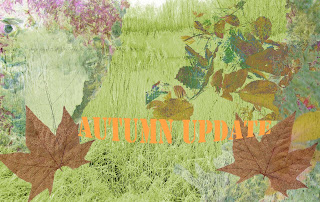
This next task was very similar to the Post Olympics banner task but we had to include the text 'AUTUMN UPDATE.' we had to also use the colour reference 1375m Pantone Solid Matt somewhere within our design. I chose to use it within my text. Size of composite 12Hx19w cm 300dpi resolution.  It was saved in an EPS format as well as psd format to retain the original layers. Layer masks were used and  I experimented with layer blending modes. The next composite was produced by playing with the Hue and 
Saturation, adjustment layers, layer masks and blending modes, dissolve and difference. Pantone Solid Matt 1375m was again used within the text.
Practising with Hue and Saturation was another task that was practised.


Friday, 4 November 2011

Using selection tools continued


Hold down the Alt key when making selections duplicates of the selection are created. The selections were also feathered and a stroke of 12 pixels was applied.


Practising with selection tools.

I practised using the different selection tools to see the effect that can be achieved. Using the magic wand was amazing and I loved the outcome. Remember this was the first time that I really practised with these tools so I am sure I will get a better understanding of the creativity that can be produced with more practise.
By holding down the Alt key after you have drawn the first rectangle with the marque tool you can make several rectangles that interlock with one another.


I used the quick mask tool and brush tool to mask out the backgound and keep the turtles colour. Selecting inverse and bringing the saturation levels to 0.

Friday, 28 October 2011

Black & White Visual Interpretation of my sampled data.

My black & white visual Interpretation of my sampled data basic but I think it is quite effective had a few goes and this was my first attempt. Will scan the leaf that I used as the surface to analyse and will also scan a copy of my data sheets.

Another two designs to add to my black and white visual interpretation of my sampled data.

Wednesday 26th October 2011 DIY Digitization Wow!


This was the topic I didn't really understand at first. I understood the data analysis of the leaf but my mind went totally blank when I had to transfer my data into a Visual interpretation using Graphic sofware.
Played around with photoshop and realised that everything sounds more difficult if you don't understand what is being asked of you. The key is if you don't understand ask until you do.

Thought I would have another go.

Thursday, 27 October 2011

Here's a few more practises!

More Masks really got the hang of things now.

More Masks

Getting more and more confident with Masks and Clipping Masks.

Masks and Clipping Masks

Well what can I say, slowly getting my head around Masks & Clipping Masks was frustrating at first but I finally managed that too. With some serious patience and practice, it's amazing what you can achieve. I found it a bit confusing at first especially  knowing which layer would create the mask but it is easy really once you know how.
The key is really to practice and have a bit of confidence you can only make mistakes and it's by making them that you learn
I have had a very difficult time with Photoshop and Illustrator as a first time user, computers are really not my best friends. I have perservered and I am determined not to give up. Couldn't draw a staight line in illustrator the pen tool was quite difficult to use I still struggle with anchor points but look now at least I can draw basic shapes.

Tuesday, 18 October 2011

Working with blogs

Well what can I say, was given a creating blog lesson by one of my students at work amazing girl.
This is my first ever blog created needs some serious work but will get there slowly but surely.
Also looked at some illustrator and photoshop tutorials determined that I am going to be competent at these design packages.

Thursday, 6 October 2011

Working with Illustrator


Yes I had a go at Illustrator yesterday for the second time at university and well at least this time I managed to draw a box using lines. Watch this space because I really think I am going to amaze myself and others
My line drawings using the pen in illustrator now at least look like a line drawing.Yippee! I found the pen tool quite a complex tool to get to grips with but the advise I was given was just keep on practising!

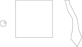
I couldn't think of drawing the basic fashion outfit that Michael asked us to have a go at copying in week 3 but look at what I have now achieved with a little bit of practise.


Illustrator was the one Digital programmes that I really found difficult to master or should I say that I found it quite difficult to handle the pen  tool but practise, practise, practise that's the name of the game.
Here we have a line version of my Essence of Belonging composite.

I think it looks effective in line and gives the composite a less cluttered over worked look, simple but yet graphical.

I have to admit that I need to definitely do a lot more practising with illustrator this drawing was done tracing over my initial composite but i need to tackle illustrator freehand to see what I can produce.All I can say as before is 'Watch this space!'